Africa, Mercator and the politics of how we see the world
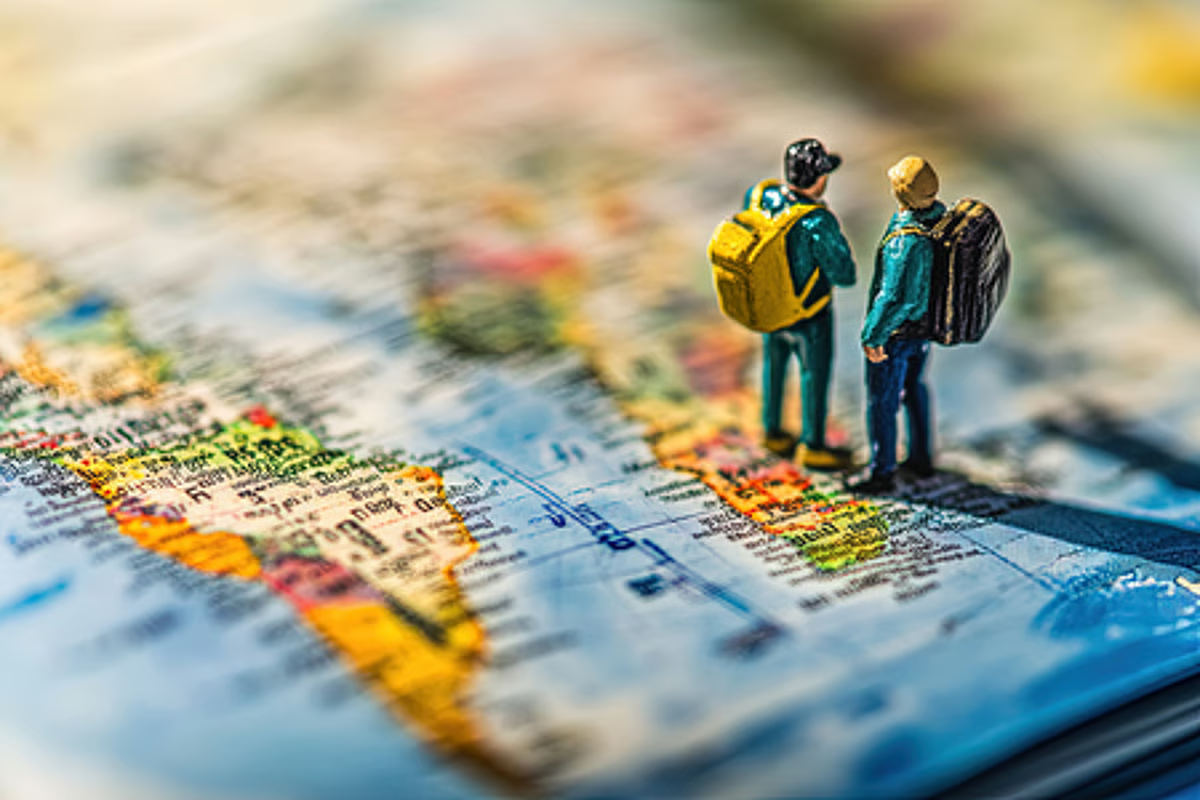
Look at a familiar world map and Africa can appear much smaller than it really is. But is Africa actually smaller? No. The problem is the way the round Earth is shown on a flat map.
The most familiar example is the Mercator projection, created in 1569. It was designed to help sailors navigate, not to show the true relative size of continents. As a result, areas farther from the Equator appear much larger than they really are, while areas closer to the Equator, including much of Africa, appear smaller.
That has now led to a wider debate about how Africa looks on world maps, and whether the way it is shown affects how people understand the continent and its place in the world.
The United Nations General Assembly has backed a push for maps that show the relative size of continents more accurately. A Togo-sponsored resolution was adopted by 164 votes to one, with the United States voting against and six countries abstaining. The resolution is not legally binding. It does not ban the Mercator projection or order countries to replace it. Instead, it encourages governments, schools, international organisations and technology companies to consider equal-area projections, such as Equal Earth, when the relative size of landmasses matters.
The United States opposed the move, calling it part of a “much larger and more radical ideological project”.
What exactly did the UN General Assembly vote on?
The UN General Assembly backed a Togo-sponsored “Correct the Map” resolution, introduced on behalf of the African Group, which represents the 54 African member states at the UN, and supported by the African Union.
The resolution encourages governments, schools, international organisations and technology companies to consider equal-area map projections when the relative size of landmasses matters.
Six countries—Estonia, Georgia, Lithuania, Moldova, Serbia and Ukraine—abstained.
Why is Africa central to the debate?
The argument centres on how dramatically some world maps can distort the size of Africa.
The Mercator projection can make Greenland appear roughly comparable in size to Africa. In reality, Africa covers about 30.4 million sq km, while Greenland covers roughly 2.2 million sq km. Africa is therefore about 14 times larger.
The same projection makes areas farther from the Equator look larger than they really are. This means northern regions such as Canada, Russia and Europe appear much bigger relative to areas closer to the Equator. South America also appears smaller than its actual relative size.
For African governments, this matters because world maps are not used only for navigation. They are also used in classrooms, the media and public institutions.
Togo’s Foreign Minister Robert Dussey said, “Maps shape our understanding of the world….It’s time for us in Africa to take responsibility to change what we can change ourselves.”
Why was the Mercator map created in the first place?
The Mercator projection was not designed to compare the size of continents. It was created by Flemish cartographer Gerardus Mercator to solve a practical problem for sailors.
Its major advantage was that straight lines could represent constant compass directions. This made navigation easier.
The trade-off was area. The farther a region is from the Equator, the more its size is exaggerated.
So, the problem is not that Mercator is simply “wrong”. It was designed for navigation and works for that purpose. The issue is that a projection designed for navigation became a dominant two-dimensional image of the world and was then used for purposes it was never designed to serve.
Can any map be completely accurate?
No. That is the basic problem with every world map.
The Earth is three-dimensional and a world map is flat. When the round Earth is placed on a flat surface, something has to be changed. A map may sacrifice area, shape, distance or direction.
Mercator sacrifices area in order to preserve direction. Equal Earth gives greater importance to area, but it cannot perfectly preserve every other geographic feature.
Equal Earth is a map projection developed in 2018 by Bojan Šavrič, Bernhard Jenny and Tom Patterson to give a more accurate representation of the relative area of continents and countries.
It does not make Africa larger. Instead, it reduces the exaggeration applied to land closer to the poles and shows the relative sizes of landmasses more accurately.
Accurate proportions: It shows the true relative sizes of continents and landmasses, correcting the size distortions found in older maps such as the Mercator projection.
Visual appeal: It resembles the popular Robinson projection while retaining its equal-area properties.
Globe-like appearance: Its curved sides give a sense of the Earth’s spherical shape.
How do Equal Earth and Mercator compare?
The two projections were created for different purposes.
Its primary purpose is to show accurate and visually balanced sizes of continents for general world maps.
It is an equal-area projection, meaning countries and continents are shown in their true relative size.
However, it causes some distortion in shapes, especially near the outer edges and poles.
This projection has curved sides that give it a rounded, globe-like appearance.
Its primary purpose was marine navigation. It was created so that constant compass bearings could be shown as straight lines.
It distorts area by making landmasses farther from the Equator appear much larger. Greenland, for example, can look similar in size to Africa even though Africa is about 14 times larger.
At the same time, it preserves local shapes and angles very well. This is why it remains useful for navigation and some types of mapping, including street-level mapping such as Google Maps.
Its basic visual form is rectangular.
Togo and the African Union argue that repeated visual distortion can shape how people see Africa’s place in the world.
The UN resolution describes correcting this imbalance as a matter of “cognitive justice and memorial reparation”.
Dussey has stressed that the campaign is not an attack on the Mercator projection and is not an attempt to rewrite geography.
“A fair world begins with a fair map,” he said. “A map is never neutral. It shapes perceptions.”
Why did the US oppose the resolution?
Washington argued that the debate had moved beyond cartography and into ideology.
The US representative said: “This resolution mocks the work and purpose of this institution.”
She objected particularly to references to reparations and “cognitive justice”. She argued that the map debate was part of “the much larger and more radical ideological project it belongs to”.
She also described such initiatives as “barnacles on our work here and the reason this institution is losing its credibility.”
India supported the resolution but stressed the technical and educational value of more accurate maps rather than endorsing one particular projection.
Indian diplomat Raghoo Puri said: “Maps play an important role in how societies understand geography and the relative scale of the world around us.”
He added that equal-area projections are valuable because they “preserve the relative sizes or areas of continental and territorial landmasses.”
At the same time, India argued that the UN should remain “technological and methodological neutral”. In other words, different projections should be allowed to be used for different purposes.
India’s explanation of its vote also made clear that its support was for the broader use and consideration of equal-area projections, not for the Equal Earth projection or any other particular map.
What did the India’s foreign ministry clarify later, and why?
The MEA clarified that India’s vote in favour of the UNresolution on equal-area world maps did not mean that India endorsed thespecific “Equal Earth” projection or any particular map.
It made this clarification because the resolution could otherwise be interpreted as India accepting a map or territorial depiction that does not match India’s official map, particularly regarding Jammu & Kashmir and Ladakh. The MEA therefore reiterated that India’s territory must be depicted according to its official map and that any inaccurate or misleading representation is "non negotiab
Ukraine supported the broader argument about correcting historical distortions but raised concerns about territorial disputes.
Its representative warned that some Equal Earth representations could create ambiguity around Ukrainian territory occupied by Russia.
Ukraine cautioned that endorsing a projection without safeguards could open a “Pandora’s box”.
The European Union also supported the resolution while stressing that it had no implications for sovereignty, territorial status or internationally recognised borders. The UN record likewise states that the resolution does not alter or affect internationally recognised boundaries or the status of disputed territories.
What did France say about changing the map?
France, which co-sponsored the resolution, announced that it would abandon the Mercator projection because its use gives Russia and China “a disproportional visual prominence”.
French Foreign Minister Jean-Noël Barrot said: “Changing maps obviously does not change the world, but correcting a distorted representation is already an act of truth.”
What does the UN vote actually change?
Legally, very little.The resolution is not legally binding. It does not require countries or institutions to abandon the centuries-old Mercator projection, which remains one of the world’s most widely used maps. It does not impose Equal Earth or any other single replacement.
Instead, it encourages wider use of equal-area projections such as Equal Earth, which more accurately show the true relative size of countries and continents, particularly Africa, although their shapes are somewhat distorted.
The vote can, however, have a symbolic effect. It gives overwhelming international backing to a simple proposition: when maps are used to teach geography or compare the size of continents, the way land is represented can shape how people understand the world.
As Dussey summed it up: “A fair map does not change the geography of the world, it changes how we see the world.”
Related Stories
 World
World
Sault triathlete takes on two world championships in one month
41 minutes ago
 World
World
Canadian survivor of 9/11 looks back 25 years later
41 minutes ago
 World
World
Thousands turn out in Serbia for funeral of 'Butcher of Bosnia' Ratko Mladić
1 hour ago
 World
World
Canadian survivor of 9/11 terror attacks tells his story
1 hour ago
 World
World
France sets 3
2 hours ago
 World
World
The steel 'embodies his soul': 9/11 family takes World Trade Center beam across US
2 hours ago
 World
World
France put on a record
2 hours ago
 World
World
The Consequences We Should Have Seen Coming
4 hours ago